 Twitter VS Facebook (Office view)
twitter.com
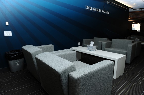
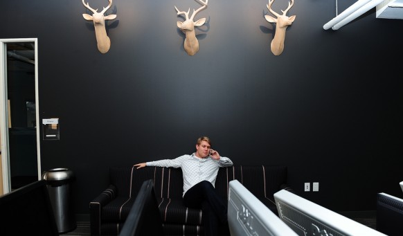
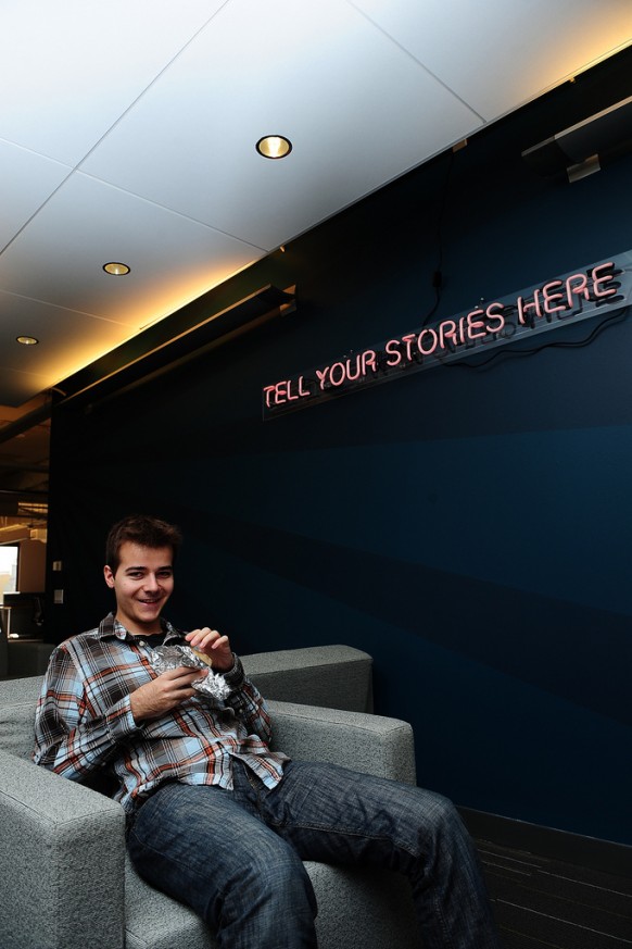
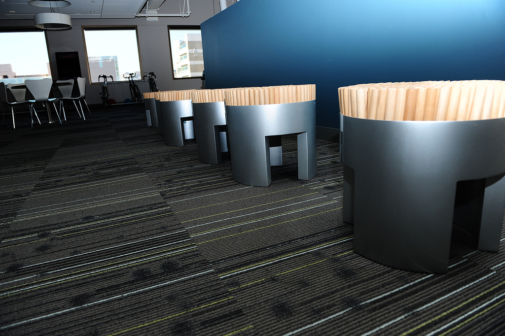
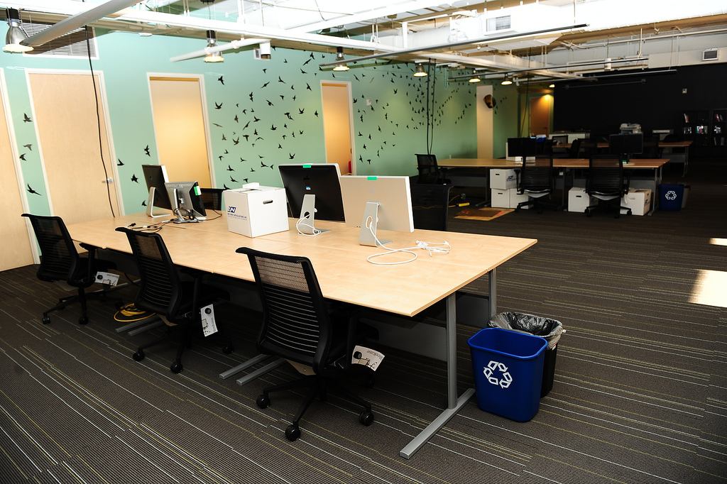
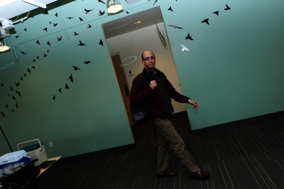
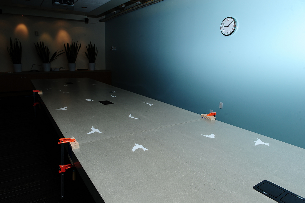
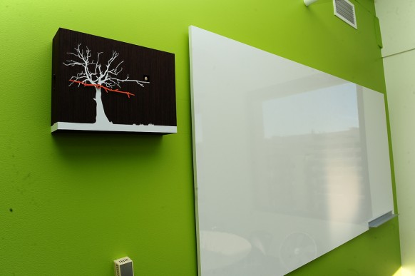
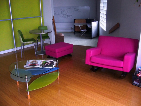
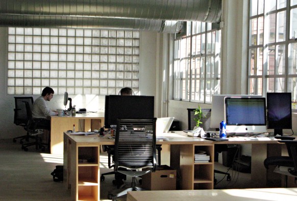
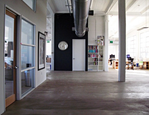
Remember that Twitter office we featured a while back at Home-Designing? We just received news that Twitter folks have moved office again. The new office is at a location just around the corner from the old one but the interiors are way swankier! Bright coloured walls, Twitter graphics, Arne Jacobsen egg chairs and a heavy dose of animal figurines really makes the place look alive. The word around is that co-founder Ev Williams’s wife, Sara Morishige aided with the interior design.


facebook.com
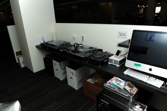
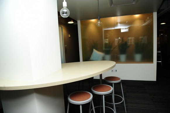
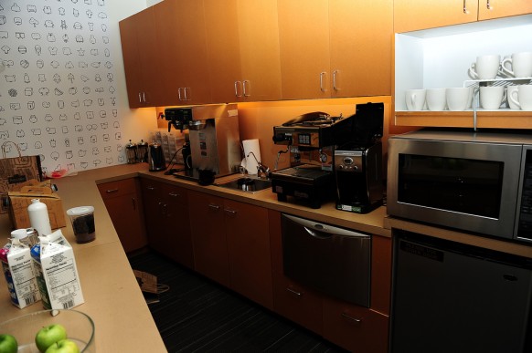
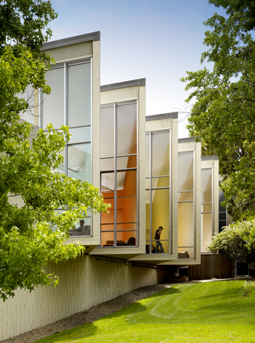
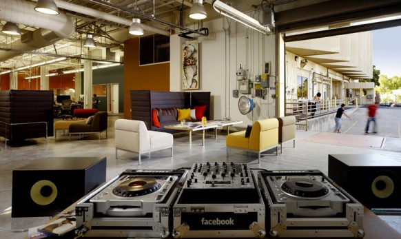
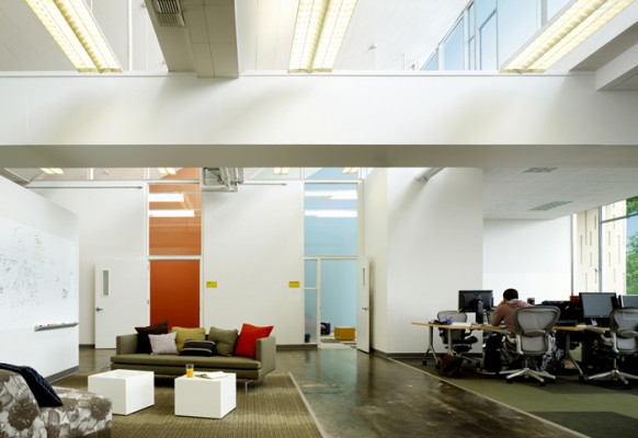
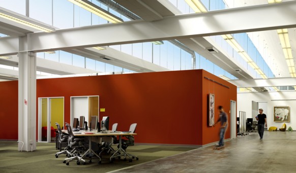
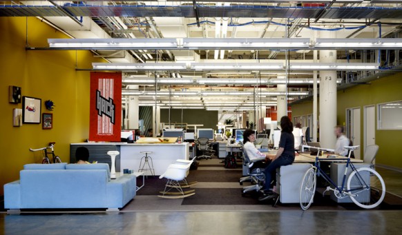
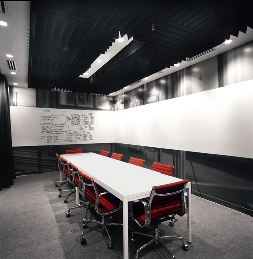
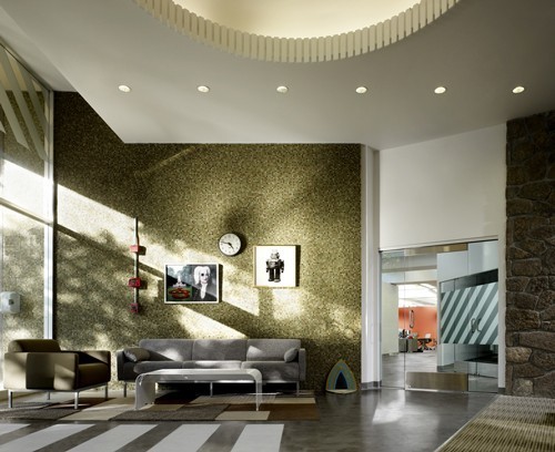
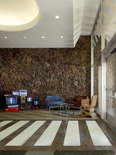
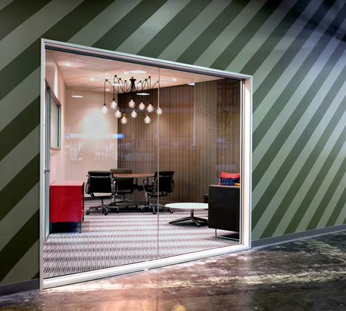
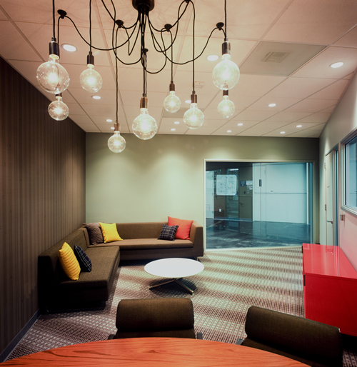
Studio o+a was responsible for redesigning Facebook’s new 150,000-square-foot office at Palo Alto, California, USA. During the design process, the design firm consulted employees to find out their expectations about the work environment and they designed the space for each department with a different twist. There is another interesting point here. Some of the walls have been left white and some places look as though they still might need some work. According to Facebook employee Everett Katigbak, this has been done on purpose as he notes on his blog: Just as people make the space on the website their own, we’ve opted to do the same with our physical space. We’ve left a lot of the walls white and the spaces unfinished to encourage employees to add the finishing touches.
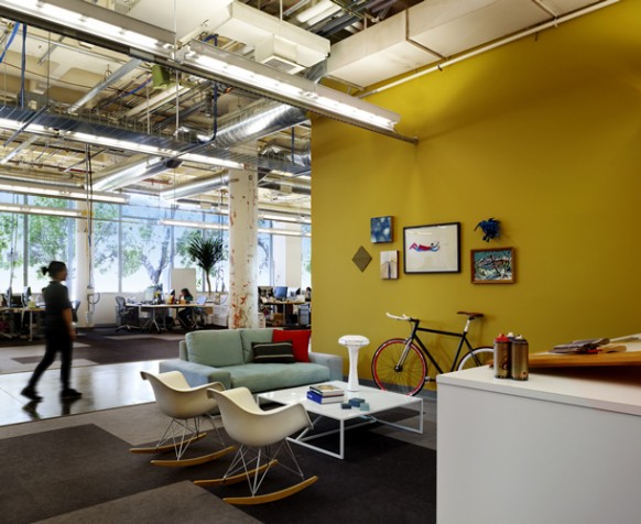
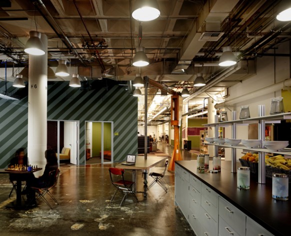
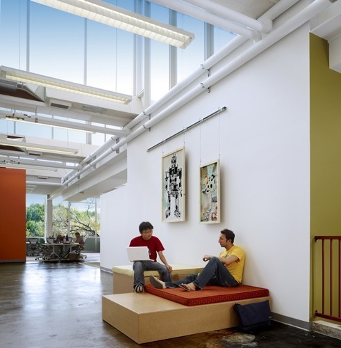
Twitter VS Facebook (Office view)Remember that Twitter office we featured a while back at Home-Designing? We just received news that Twitter folks have moved office again. The new office is at a location just around the corner from the old one but the interiors are way swankier! Bright coloured walls, Twitter graphics, Arne Jacobsen egg chairs and a heavy dose of animal figurines really makes the place look alive. The word around is that co-founder Ev Williams’s wife, Sara Morishige aided with the interior design.
Spoiler for ini kantornya twitter...:


Spoiler for masih twitter...:


facebook.com
Studio o+a was responsible for redesigning Facebook’s new 150,000-square-foot office at Palo Alto, California, USA. During the design process, the design firm consulted employees to find out their expectations about the work environment and they designed the space for each department with a different twist. There is another interesting point here. Some of the walls have been left white and some places look as though they still might need some work. According to Facebook employee Everett Katigbak, this has been done on purpose as he notes on his blog: Just as people make the space on the website their own, we’ve opted to do the same with our physical space. We’ve left a lot of the walls white and the spaces unfinished to encourage employees to add the finishing touches.
Spoiler for basecamp nya facebook nih..:


Langganan:
Posting Komentar (Atom)

Translate This Blog :
Blog Teman
Kalender
Archives
Labels
About Me
FauziSecret Fan Box
Suara Pembaca
|
|


3 komentar:
facebook's office more exclusive than twitter's office..
but both of them the great conection office to internet
Gimana dengan Microsoft, Google, dan Yahoo ya???
gimana dengan kantor fauzisecret ya? hehehe
pasti bisa jawab teka-teki ini:
http://kangmoes.blogspot.com/2009/11/tes-otak-kanan-anda-dengan-teka-teki.html
Posting Komentar
Dipostingkan oleh : mtfauzi
Silakan beri komentar, kritik, maupun saran anda........